
Now that we have learned how to get rid of related videos when embedding a YouTube video on a website, let’s move on to embedding a video so it is mobile friendly when posted on a website.
Here is a screen shot of some basic steps shared by Dave Wiens, EdMedia, that he said should work on all our liferay websites. I’m using a screen shot as WordPress changes the coding to something else when I type it in directly.
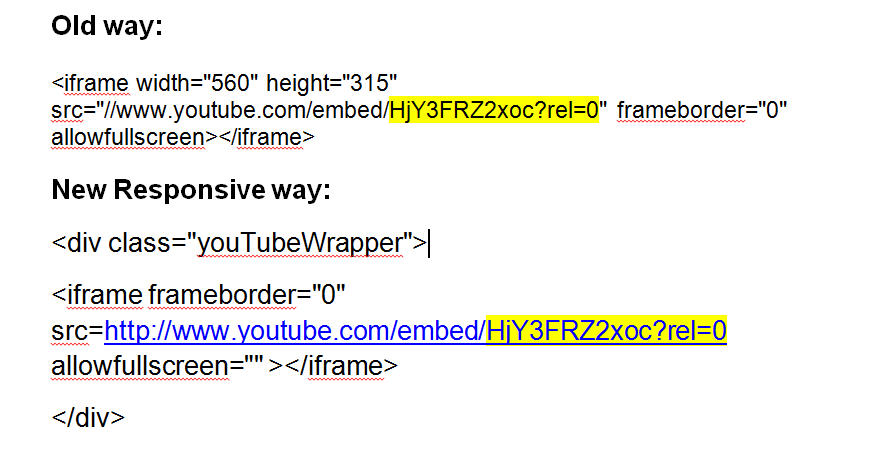
Here is what you will see in the screen shot:
- The original coding is taken directly from this YouTube video. NOTE: I unchecked “show suggested videos when the video finishes” and got a “?rel=0″ after the YouTube video ID. (0 is zero)
- I have highlighted in yellow the video ID from the old coding that I put into the correct location in the new coding. I found it was easier to just drop the one into the other than try to type it all from scratch.
- Note: When you use the coding, remove spaces between the different parts – I showed them this way so you could view the sections more easily.
Switching from the old coding to a new responsive coding to make embedding a YouTube video in Liferay more mobile friendly
When you first look at the new version of your video while you are directly working on the file, it will look small:
(FYI – YouTube gives you a choice of 3 thumbnails for videos – the thumbnail below was the best of choices and does not reflect on the quality of the actual slides.)

However, when you view it as it actually looks on the web, it will appear much larger. The video will be “responsive” to the size of the webpage on which it is embedded.

And finally, here is how it looks on my phone:

To check out the video on your own phone, visit the webpage where it was posted.
Questions or comments? ahenneman@unl.edu
